The goal of every website is to make users happy, whether its purpose is to provide news stories or sell consumer goods. With more users browsing the web on their mobile devices than ever before, this means that a mobile-friendly site is a necessity rather than a bonus.
If you’re optimizing a site to be mobile-friendly, you’ll only need ten smart tactics to start earning more mobile visitors, improving the user experience and boosting conversions.
- Why Be Mobile-Friendly?
- 1. Adopt Responsive Design
- 2. Place Essential Elements Above the Fold
- 3. Optimize Site Speed
- 4. Streamline Navigation
- 5. Simplify Shopping
- 6. Make Searching a Breeze
- 7. Use Pop-Ups Sparingly
- 8. Eliminate Text Walls
- 9. Pick the Perfect Font
- 10. Run Some Tests
Why Be Mobile-Friendly?
If you do most of your online activities on a laptop or desktop computer, mobile-friendliness might seem like an afterthought. And yet, those who don’t frequently use mobile devices to browse the web are in the minority.
As of September 2020, more than half of all web traffic is mobile. Compare that to September 2010, when the same could only be said for 3.5 percent of traffic:
It’s not just a few overzealous smartphone users driving up the numbers, either. Pew Research discovered 76 percent of adults in advanced economies own smartphones, as do 45 percent of adults in emerging economies.
So, mobile-friendliness can’t be an afterthought—instead, it must be a top priority for every modern web developer and SEO practitioner. By using ten proven tips to improve mobile performance, you can make the site you’re optimizing load quickly, run smoothly and look beautiful for all its mobile visitors.
1. Adopt Responsive Design
When you watch one episode of a show on a TV but view the next episode on a laptop, the episode looks identical on both devices. It makes no difference what brand of TV you have or how big your laptop is—the show performs the same regardless.
Responsive web design is driven by that same idea: No matter what type of device a visitor is using, the site will automatically adjust its layout to look and perform its best.
On the other hand, websites created using adaptive design require different layouts be manually created for each device type. This means there must be one layout for 5.8-inch smartphones, one for 6.1-inch smartphones and so on.
A handy graphic from Cleveroad illustrates this concept perfectly:
But why would you want to use responsive design over adaptive design? With responsive design, since the site works equally well across all platforms, it only needs to load a single universal layout.
By contrast, a site using adaptive design must load all possible layouts simultaneously, and visitors using a device for which a custom layout wasn’t created may receive a subpar user experience.
To implement responsive design and ensure each mobile visitor’s user experience is seamless, you’ll need to use HTML and CSS to modify each page’s content. W3Schools offers a straightforward step-by-step tutorial for CSS, and another for HTML. Or, take a look at Google’s responsive design guidelines for a more basic overview.
2. Place Essential Elements Above the Fold
When newspapers are folded and displayed on a newsstand, only the upper portion of the front page is visible to passersby. This is known as above the fold content, and it’s just as relevant for digital media as it is for print.
In the online world, above the fold content refers to every element of a web page visitors can see without scrolling. The more carefully you arrange a page’s above the fold content, the better visitors’ experience will be.
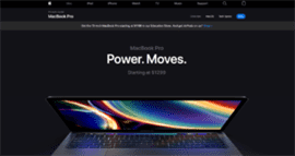
For instance, observe how the above the fold content for one of Apple’s MacBook landing pages contains multiple nuggets of essential information. Right off the bat, users are presented with the product’s name, a catchy slogan emphasizing its benefit, its starting price, an attractive photo of the product, a potential discount and a buy button, all without sacrificing the page’s minimalist design:
On the mobile version of the same page, even more product information is immediately visible:
This is a prime example of mobile-optimized above the fold content. Apple knows mobile users don’t want to scroll or click buttons any more than absolutely necessary, so they include as much vital information as possible at the very top of the page while maintaining a clean and simple aesthetic.
When you’re optimizing pages for mobile use, strive to emulate Apple’s approach by providing mobile users with all the most important information from the get-go, and remember to make any above the fold buttons big enough to click with a quick finger tap.
3. Optimize Site Speed
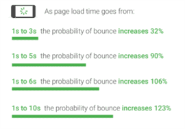
Mobile users are highly sensitive to site speed, and Google has gathered the data to prove it. The longer a mobile page takes to load, the higher the probability of mobile users’ bouncing (i.e. leaving the site):
So if you want to retain as many mobile visitors as possible, you need to maximize page speed.
A few straightforward techniques can help any mobile page load quickly and efficiently:
- minify code;
- don’t use overly large or high-resolution images and videos;
- reduce server requests;
- limit redirects;
- load above the fold content first; and
- use clean, minimal design.
4. Streamline Navigation
The last thing mobile users want to do is click several tiny, barely legible links to get where they want to go. To avoid such a poor user experience, work to make mobile navigation as smooth and effortless as possible.
Start by identifying the internal links that visitors click the most. If you’re optimizing an e-commerce site, for example, those may include the shop, shopping cart and new buttons, along with any main category pages.
Take for example Sephora’s mobile site. At the top of the page, users can quickly access new products, browse carried brands and visit major store categories. At the bottom, they can click on the main shop page, view their profile, locate stores and see current offers:
With a similarly well-organized navigation system, you can help mobile users find what they’re looking for with minimum effort.
While planning a site’s mobile navigation system, remember to consider the number of taps and scrolls it will take for users to accomplish their goal—the fewer, the better.
5. Simplify Shopping
If you’re optimizing an e-commerce site for mobile use, consider whether the shopping experience will be as simple and seamless for mobile shoppers as it is for their desktop-using counterparts.
Try answering a few key questions to help see things from a customer’s perspective:
- Are product images easy to swipe through with a single touch?
- Is it easy to click the add to cart and shopping cart buttons?
- On the shopping cart page, are added items clearly displayed?
- Is the checkout button large enough to effortlessly click?
- Once the checkout process begins, how many buttons does the customer need to click?
- Is the customer presented with an easy-to-use numeric keypad when filling out numerical fields (e.g. a credit card number or postal code)?
Want an in-depth rundown of what makes a fantastic mobile checkout experience? You’ll love CleverTap’s round-up of expert advice.
6. Make Searching a Breeze
When mobile users are trying to find a specific product or page, they’re even less willing than desktop users to navigate a maze of menus and links. To keep those users interested, you need to provide a clearly visible and easy-to-use search bar.
L.L. Bean’s mobile site, for instance, features a search bar that extends across the entire width of a mobile browser for maximum clickability:
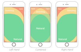
If you opt to use a search bar users need to click to open, keep in mind that some areas of smartphone screens are easier to reach than others. This concept is known by some mobile site designers as the thumb zone:
If you place a site’s search bar or button as close to the thumb zone as possible, you’ll give mobile users an irritation-free way to find exactly what they’re after.
7. Use Pop-Ups Sparingly
Almost all of us can agree pop-ups are annoying—in fact, 73 percent of consumers report disliking them (ouch, poor pop-ups). They can be especially irritating on mobile sites, namely when the button to close them is nearly microscopic.
And yet, pop-ups are demonstrably effective: For one e-commerce platform, they increased conversions by a shocking 2,100 percent. For a content marketing company, they boosted email opt-in rates by 400 percent.
So, it’s up to you to strike a balance between annoying visitors and leveraging pop-ups’ power. For mobile users, this comes down to the close button. No matter what type of pop-up ad a site uses, it should always be easy to exit them on mobile devices.
Lush Cosmetics’ mobile site offers a first-rate example. Their email sign-up pop-up doesn’t obscure the entire screen, and the button to close it is not only large enough to easily tap but also firmly within the thumb zone:
Adopt a similar strategy on the site you’re optimizing and you’ll engage mobile users, not drive them away.
8. Eliminate Text Walls
Brief paragraphs are undeniably easier to read than long blocks of text. This isn’t just because they make it easier for users’ eyes to track—when well-organized, paragraphs can also help users better understand content’s purpose, topic and narrative.
Paragraphs and text organization in general are so important to the user experience that the World Wide Web Consortium’s Web Content Accessibility Guidelines (WCAG) contain specific guidelines for their use. The WCAG recommends you:
- develop a single topic or subtopic for each paragraph;
- establish logical relationships between phrases, sentences, paragraphs and walls of text;
- avoid using sentences longer than the typical accepted length for secondary education; and
- consider breaking up longer sentences into shorter ones.
Following such guidelines will improve site readability for mobile users in particular—with mobile devices’ smaller screen sizes, hard-to-read walls of text can become even more troublesome than they are on desktop computers.
You may also want to consider using visually appealing images to break up long-form content, provided they’re easy to view and scroll past on mobile devices.
9. Pick the Perfect Font
The world of typefaces and fonts is surprisingly full of passion—announce that Papyrus or Comic Sans is your favorite and you’re sure to unleash a spate of strong opinions.
But when optimizing a site for mobile use, your only font-related concern should be readability—when browsing the web on a small screen, visitors need fonts to be clear and sharp, not highly stylized.
While a font’s readability is subjective to a degree, several foolproof options exist. Some are serif (contain decorative strokes known as serifs) while others are sans serif (don’t contain those strokes), but all are exceptionally legible.
- Open Sans: A sans serif typeface designed by Steve Matteson, Open Sans has an open, approachable appearance and was optimized for print, web and mobile interfaces alike.
- Georgia: A serif typeface designed by Matthew Carter, Georgia was specifically created with low resolution screens in mind.
- Helvetica: A sans serif typeface designed by Max Miedinger, Helvetica sports a simple and straightforward style that’s made it popular in both corporate and government settings.
- Arial: A sans serif typeface designed by Robin Nicholas and Patricia Saunders, Arial was originally created for use with IBM laser printers and remains one of the most easily readable choices available.
- Verdana: Another sans serif typeface designed by Matthew Carter, Verdana has a clear, rounded appearance and was specially created to overcome the challenges of on-screen display.
10. Run Some Tests
To see whether your mobile-friendly practices have paid off, you’ll need the site you’re implementing to pass a mobile-friendly test.
You can’t go wrong with Google’s own mobile-friendly test—to use it, simply paste in the URL of the page you’re testing. Google will return a quick summary of the page’s mobile-friendliness, any loading issues and a preview of how the page will look on a mobile device:
Optimizing for textBing search too? Run the site you’re working on through the Bing mobile-friendliness test for good measure.
Mobile Friendliness Is User Friendliness
As mobile devices become increasingly intertwined with all of our lives, mobile optimization is non-negotiable. No matter where a site’s visitors are located, it’s up to you to meet them where they are—in this case, the smartphones that rarely leave their side.
So if you want a site to be user friendly, it must also be mobile-friendly. With the right mobile-friendly practices in place, your visitor count, conversions and user retention will start looking a whole lot friendlier too.
Image credits
StatCounter / September 2020
Cleveroad / September 2016
Screenshots by author / September 2020
Think with Google / February 2018
Smashing Magazine / September 2016

