It may not surprise you to learn the phrase “a picture is worth a thousand words” was first coined by an advertising executive (Fred R. Barnard, if you’re curious). Analog or digital, images can convey in a fraction of a second what might otherwise take multiple paragraphs to explain.
In terms of SEO, though, images offer much more than visual appeal. With proper image optimization, sites load more quickly and achieve better search engine rankings. They also become more accessible to people who are blind or have visual impairment. That’s a vision we can all appreciate, and it only takes a few simple strategies to realize.
- Rein in Image Size
- Embrace Efficient Loading
- Create User-Friendly Alt Text
- Use Straightforward File Names
- Choose File Formats Wisely
How Image Optimization Can Upgrade Any Site
If you’re an SEO practitioner, you’re aware image optimization can help improve page speed. When a site’s images aren’t hogging server bandwidth, its pages are free to load faster than you can say “gigabit internet.”
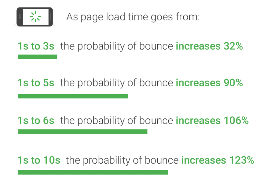
Since mobile users are 32 percent more likely to leave pages taking three or more seconds to load, such a speed increase can mean the difference between turning a visitor into a reader and losing them forever:
Just as importantly, thorough image optimization helps improve a site’s accessibility for an underserved segment of users. Since at least 2.2 billion people around the world have a vision impairment of some kind, better accessibility opens a website to a large segment of potential new visitors.
As a bonus, some accessibility-improving techniques (such as alt text) can even help a page rank higher for targeted keywords.
Between faster loading times and the opportunity to reach a new audience, what’s not to like about image SEO? All you need are the right strategies.
Rein in Image Size
Large, high-resolution images can be gorgeous, but they’re not always SEO friendly. The bigger an image file, the more time required to load it. Every increase in resolution adds pixels and precious seconds to load times, leaving visitors to stare at an empty page or a partially loaded image.
The alternative isn’t very appealing either. Serving up a load of tiny, blurry images just to trim load times sacrifices professionalism and polish. And it definitely won’t create a better experience for users.
You can get the best of both worlds by reducing size and resolution without compromising image quality. You can achieve this with compression. In very (un-)technical terms, compression works by squishing image data until it’s compact and easier to load.
To optimize image size, you can choose between two types of compression: lossy and lossless. As their names imply, lossy compression can create exceptionally small file sizes but results in a loss of image quality (e.g., clearly visible pixels), while lossless compression creates larger files whose quality remains intact.
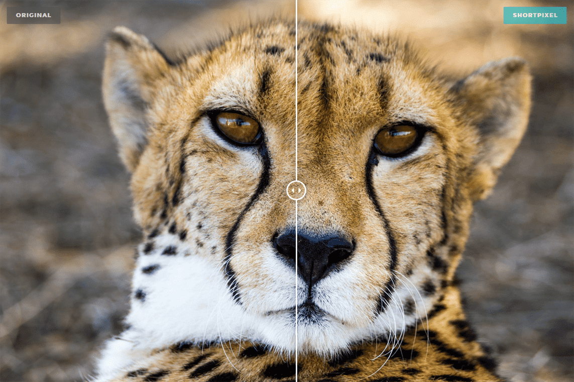
In most cases, modern lossy compression won’t noticeably reduce quality. Take an image of an exceptionally dashing cheetah, for example. Using ShortPixel’s lossy image optimization tool, we shrank the file size from 3.2 MB to 0.6 MB while retaining 82 percent of the image quality.
As the built-in comparison tool shows, there’s barely a visible difference between the two:
For image-focused sites displaying high-definition pictures subject to closer scrutiny, though, lossless compression is still the better choice.
ShortPixel offers lossless compression too, as do a number of other tools such as Compressor.io and Kraken.io.
If you use WordPress, you can also take advantage of handy plugins like Smush or the EWWW Image Optimizer.
Don’t forget about image dimensions either. Specify the dimensions of each image before publishing. Squarespace, for example, recommends an image width of 1,500 to 2,500 pixels.
Embrace Efficient Loading
Achieving lightning-fast image loading isn’t just about file size and resolution. It also has to do with the type of loading being used.
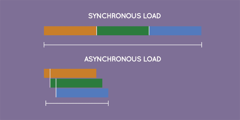
Traditionally, a web page is loaded synchronously. In other words, its elements (images, text, etc.) are loaded in order from top to bottom. If a page element at the top of the page takes a while to load, nothing else on the page will load in the meantime, sending users on a virtual trip to the ’90s, when the only thing higher than the hair was internet load speed.
You can avoid synchronous loading’s downsides with asynchronous loading. This approach loads all of a page’s elements at the same time. So even if an image at the top of the page is taking a few seconds to load, text and images underneath load on their own.
To implement asynchronous loading, use the async attribute for HTML or the async function for JavaScript.
Implementing asynchronous loading in CSS is a bit more complicated, as is doing so in PHP, so be prepared to ask a developer for help if you’re not comfortable working with either.
Lazy loading is another loading method webmasters can use to improve a site’s performance and user experience. While technically a form of synchronous loading, lazy loading tells browsers to load only what’s visible. If a user is viewing the top of a page, the browser won’t load the rest of the page until the user scrolls down.
Lazy loading has a potential SEO challenge, though—inadvertently hiding content from search engines. You can prevent that by fixing lazy-loaded content to make sure it’s crawlable.
Create User-Friendly Alt Text
One of the easiest ways to optimize image accessibility is adding alt text. Short for alternative text, alt text is an HTML attribute containing a brief description of the tagged image.
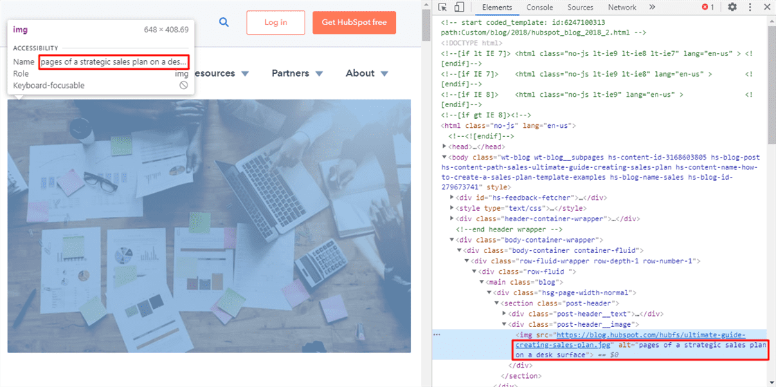
For instance, a HubSpot blog post uses an image of people using laptops and looking through papers on a table:
Right-clicking on the image in a browser and clicking inspect opens a panel displaying the page’s HTML code. In Google Chrome, doing so automatically scrolls to the portion of code associated with the image and reveals its alt text both within the inspection panel and in a handy window over the image.
In HubSpot’s case, that alt text is pages of a strategic sales plan on a desk surface:
For non-visually impaired visitors, the alt text will only show up if the image fails to load. For visitors with a vision impairment, the alt text can be communicated via assistive technology such as a screen reader.
Adding alt text to a site’s images is as simple as copy and pasting a single line of code. Just open up the site’s HTML editor and insert:
<img src=”IMAGE-FILE-NAME.JPG” alt=”ALT TEXT HERE”>
Depending on the content management system (CMS) you’re using, the process can be even easier. In WordPress, you can add alt text when uploading or editing an image. Similar options exist for other CMS platforms such as HubSpot, Squarespace and the like.
Make your alt text descriptive and clear, and never compromise readability or accuracy in the name of adding more keywords. To accommodate the limits of most screen readers, keep alt text to 125 characters or fewer.
Use Straightforward File Names
Are you giving your image files names like screenshot-1, screenshot-2 and so on? If you are, you’re missing out on a major (but easily overlooked) SEO opportunity.
Search engines use file names to understand images. In fact, the words in an image’s file name double as keywords for the page where it appears.
Set your sights on two goals when crafting image file names:
- Describe the image in a way search engines and humans can understand.
- Include targeted keywords where natural and relevant.
For example, take this image of a fruit smoothie from Unsplash:
You don’t want to name it something completely indecipherable like IMG02839.jpg. Naming it smoothie.jpg would be better, but still lacking in detail and keywords.
To take full advantage of the file name’s SEO power, use something like:
- smoothie-banana-and-berries-on-white-table.jpg;
- berry-smoothie-on-windowsill.jpg; or
- fruit-smoothie-in-glass-with-straw.jpg.
Detailed and concise names make it easy for both users and search engines to get a clear idea of the image’s contents. Search engine crawlers will have several keywords to take into account, too.
Choose File Formats Wisely
If you’ve ever researched image file formats, you already know just how many exist. From the Tagged Image File Format (TIFF) to Adobe’s proprietary Photoshop Document (PSD), you have plenty of options.
For SEO purposes, though, you only need to worry about a few. Google Images supports only five file formats: primarily, the ever-popular JPEG and PNG, plus BMP, GIF, WebP and SVG.
Each format supports one or more compression types:
- JPEG files support lossy compression and are indicated by the file extensions .jpg or .jpeg. The name JPEG is an acronym for Joint Photographic Experts Group, the file format’s founding committee.
- PNG files support lossless compression and are indicated by the file extension .png. The name PNG stands for Portable Network Graphics.
- BMP files are uncompressed and are indicated by the file extension .bmp. The name BMP is derived from bitmap image file.
- GIF files support lossless compression. They’re indicated by the file extension .gif, and the name GIF is an acronym for Graphic Interchange Format.
- SVG files support lossless compression. They use the file extension .svg, and the name SVG is shorthand for Scalable Vector Graphics.
- WebP (pronounced “weppy”) files support both lossy and lossless compression, and are indicated by the file extension .webp. Developed by Google, this format’s name is short for Web Photo.
When saving images for use on a website, select one of Google’s supported file types for smooth sailing. If you’re unsure which format to use, find the best fit by considering how you want to use the image:
- JPEG files work for most photographs, especially those you don’t expect visitors to enlarge or zoom in on.
- PNG files are ideal for finely-detailed graphics such as logos or charts. They also support transparency, and can help prevent fuzzy screenshots.
- BMP files are typically quite large and are designed specifically for Windows operating systems, so it’s best to avoid using this file format on websites.
- GIF files are commonly used for animated images. They can also be used for graphics with limited color palettes.
- SVG files are made of smooth curves and lines rather than pixels, so they can be scaled up and down without reducing image quality. They support transparency, animation and interactivity, making them a solid choice for vector graphics, illustrations and intricate diagrams.
- WebP files are a smaller-sized (but not visibly lower-quality) alternative to larger PNG, JPEG or GIF files. Keep in mind WebP images aren’t supported on Apple’s Safari browser or iOS operating system as of July 2020.
Shed Some Light on Your Images
A picture may be worth a thousand words, but most of those words may be four letters long if you use unoptimized images. Creating crisp, beautiful images only pays dividends if those images reach their target audience with speed and efficiency.
Take advantage of smart image optimization techniques to ensure all visitors—both bot and human—have the ability to appreciate and learn from the images you share.
Image credits
Think with Google / February 2018
Cheetah photo by Piet Bakker / April 2016
WEBI / May 2016
HubSpot / June 2020
Screenshot by author / July 2020
Smoothie photo by Denis Tuksar / October 2019

